UESPWiki:Featured Images/Past Nominations/Archive 4
| This is an archive of past UESPWiki:Featured Images discussions. Do not edit the contents of this page, except for maintenance such as updating links. |
This is an archive of past nominations for Feature Images from July 2013 to December 2013.
Índice
- 1 File:OB-place-Bravil 05.jpg
- 2 File:OB-quest-Dagon Shrine 02.jpg
- 3 File:SR-quest-A New Order.jpg
- 4 File:SR-creature-Pack_Member.jpg
- 5 File:SR-quest-A Daedra's Best Friend 04.jpg
- 6 File:DB-quest-Old_Friends_02.jpg
- 7 File:DB-place-Gyldenhul Barrow.jpg
- 8 File:SR-quest-Lost to the Ages.jpg
- 9 File:SR-quest-Lost to the Ages 02.jpg
- 10 File:BS-Soul Cairn Burial Chamber of an Ideal Master.png
- 11 File:SI-quest-Everything In Its Place 2.jpg
- 12 File:BM-place-Iggnir River.jpg
- 13 File:SR-npc-Lord_Harkon.jpg
- 14 File:SR-quest-Dragonslayer.jpg
- 15 File:DB-place-Edla's_House.jpg
- 16 File:SR-quest-The Battle for Fort Amol.jpg
- 17 File:SR-quest-Robber's Gorge.jpg
- 18 File:SR-npc-Ulfric Stormcloak 07.jpg
- 19 File:OB-creature-Minotaur Lord.jpg
- 20 File:SR-creature-Otar_the_Mad.jpg
- 21 File:BM-place-Solstheim.jpg
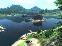
File:OB-place-Bravil 05.jpg
A great day on Cyrodiil with a view of water reflection, fort and trees. A reminder of the beautiful Cyrodiil.
- Support: As nominator. --Tiberseptim2 (talk) 00:31, 9 November 2013 (GMT)
Support: Beautiful scenery shot, which I'm always a sucker for.--Xyzzy Talk 00:56, 9 November 2013 (GMT)- Support: That bloom effect was clearly made for screenshots. Nice idyllicsm. Weroj (talk) 02:32, 9 November 2013 (GMT)
- Oppose: It's a good image, but I find it to be somewhat unremarkable. The image also seems a tiny bit too bright, which can be noticed the most when looking at the white stairs near the bottom of the image. This is very minor, but still, the image is just not remarkable enough for me to support the featuring of it. Forfeit (talk) 05:12, 9 November 2013 (GMT)
- Oppose: Looks good as a Thumbnail, but at full resolution the quality of the image is just too bad. -- SarthesArai Talk 09:57, 9 November 2013 (GMT)
- Comment: It should be pointed out that a mod was used to make Fort Grief, the Strange Door, Bravil Chapel, etc visible, since they'd be too far away to render otherwise. Compare it the older, unmodded version of the image. I'm in no way opposed to using images with modified render distances on the wiki, but putting them on the main page is kind of pushing it IMO. —Legoless (talk) 13:56, 9 November 2013 (GMT)
-
- Comment: Are you certain mods were used? The older screenshot doesn't even show the small ruin on the nearby isle (Fort Grief, I assume), which is definitely toggleable in the settings (distant buildings, or some such)... the chapel in Bravil seems like something you might not be able to see in the vanilla game, though. On the other hand, you can see some landmarks (like the tower in the middle of the Imperial City) from very far away, so I'm not sure. Weroj (talk) 12:25, 13 November 2013 (GMT)
- I'm sure. Rpeh usually used a view distance mod for both Oblivion and Morrowind, and the Strange Door is never visible from Cadlew in vanilla. You can also see minor objects like the pier near Bawnwatch and a wayshrine on the far shore, which wouldn't even have LOD models. —Legoless (talk) 01:17, 14 November 2013 (GMT)
- Comment: Are you certain mods were used? The older screenshot doesn't even show the small ruin on the nearby isle (Fort Grief, I assume), which is definitely toggleable in the settings (distant buildings, or some such)... the chapel in Bravil seems like something you might not be able to see in the vanilla game, though. On the other hand, you can see some landmarks (like the tower in the middle of the Imperial City) from very far away, so I'm not sure. Weroj (talk) 12:25, 13 November 2013 (GMT)
- Oppose: The use of mods is a sticking point, plus what I assume is the jpg compression has done horrible things to the texture of the stonework on the tower in the center. I also agree that the whole image seems blown out and over-bright. --Hargrimm (talk) 21:44, 12 November 2013 (GMT)
- Oppose: Modded images should not be featured, in my opinion. --Nocte|Chat|Look 22:37, 12 November 2013 (GMT)
- Oppose: Mods or not, the image just does not look all that good in my opinion. It's too bright, and even the nearby stonework looks grainy, as mentioned. Kozol (talk) 22:50, 20 November 2013 (GMT)
- Support: It looks pretty enough, and modded images have won in the past, so subtle mods like distance enhancers aren't exactly unprecedented. -damon xoxo 23:15, 20 November 2013 (GMT)
| Consensus: Oppose. 3 - 6 ~ Dwarfmp (talk) 20:19, 4 December 2013 (GMT) |
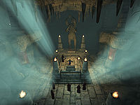
File:OB-quest-Dagon Shrine 02.jpg
This is a very good image of one of the more memorable scenes in Oblivion's main quest (though the Argonian in the back of the image provides me with some fonder memories). What really attracted me to this image were the beams of light shining toward the altar Mankar Camoran is preaching at. As a thumbnail, they do a great job of grabbing the attention of the viewer and even as a full size image they still look very nice and are certainly a feature that makes the image unique. I think this image would be a great choice to put on the main page and would certainly get the attention of plenty of viewers.
- Support: As nominator. Forfeit (talk) 00:23, 8 November 2013 (GMT)
- Support: This almost looks like a Skyrim-quality image. On top of that, great never-before-seen perspective and the light pouring in fits perfectly here. Full support from me. •WoahBro►talk 01:38, 8 November 2013 (GMT)
- Support: Indeed, it actually took me seconds to realize this isn't Skyrim, but Oblivion. Very nice! Weroj (talk) 02:20, 8 November 2013 (GMT)
- Support: Though dark it is quite nice as it is one of the only times you'll see the Shrine of the Dagon.--Tiberseptim2 (talk) 00:25, 9 November 2013 (GMT)
- Support: Very impressive image. --Xyzzy Talk 00:56, 9 November 2013 (GMT)
- Support: Nice shot -- SarthesArai Talk 09:57, 9 November 2013 (GMT)
- Support: One of my favourite images on the wiki, full support. —Legoless (talk) 13:56, 9 November 2013 (GMT)
- Support: Great framing; a dramatic shot. --Hargrimm (talk) 21:44, 12 November 2013 (GMT)
- Support: I love it. --Nocte|Chat|Look 22:37, 12 November 2013 (GMT)
- Support: I wanted to oppose it for looking similar to other lowly lit rooms that we've FI'd in the past, but I'd come off as hypocritical, since I've nominated similar images several times in the past. :p -damon xoxo 23:15, 20 November 2013 (GMT)
| Consensus: Support. No opposition ~ Dwarfmp (talk) 01:58, 21 November 2013 (GMT) |
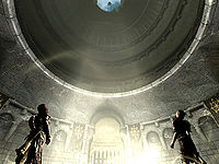
File:SR-quest-A New Order.jpg
It is an impressive image with the angle of the ray of sunlight inside Fort Dawnguard. I believe this image helps capture the feel of the expansion. This is my first time nominating, so I apologize if it is done incorrectly.
- Support: As nominator. — Unsigned comment by Adheiselt (talk • contribs) at 18:53 on 16 October 2013
- Oppose: The center of the image is rather boring, the only thin fo interest being gunmar and sorine, located at the verry bottom of the picture. Additionally, the lighting is poor, with the brightness of the sunlight directly contrasting the black backs of the two characters. -- SarthesArai Talk 19:48, 16 October 2013 (GMT)
- Oppose: It's a cool image, but I don't think it's FI material. • JAT 21:34, 16 October 2013 (GMT)
- Neutral: I like the ray of light. this effect is also in other feature images, like File:SR-quest-Lost to the Ages 02.jpg and File:SR-quest-Bleak Falls Barrow.jpg. however, this one is kinda empty, and doesnt wow much. Honeystars (talk) 07:54, 17 October 2013 (GMT)
- Support: I find this to be absolutely gorgeous - one of the best nominations ever, in fact. Very cinematic. Weroj (talk) 08:04, 17 October 2013 (GMT)
- Support: Whoah, a piece of art, right here on the wiki – perfect composition, and that is quite hard to achieve in 4:3. Excellent thumb as well. --Krusty (talk) 17:20, 17 October 2013 (GMT)
- Neutral: You called, Krusty? :p Anyways, I've been fairly quiet lately on these nominations because I simply can't decide. Here is another example. This image is quite awe-inspiring and contains a scene that I've never noticed even though I've played through Dawnguard twice. However, my main problem with this image is the fact that the light washes out the atrium (if that's what you would call that). It just looks super unnatural, at least to me. Eh, it probably is just me. Don't get me wrong, this is a fantastic shot, there's just nothing that I've noticed to give my full support (or opposition for that matter). Maybe lurking around a bit more and seeing what others say will help sway my vote one way or the other, but for now, I'm pretty much in the middle. •WoahBro►talk 17:54, 17 October 2013 (GMT)
- Support: I don't think this scene can be captured any better. Pretty much a no-brainer from there. Minor EditsThreats•Evidence 04:18, 18 October 2013 (GMT)
- Support: This is pretty great. The swirling effect of the light on the walls makes this interesting enough for me. --AKB Talk Cont Mail 16:53, 30 October 2013 (GMT)
| Consensus: Support. Five Supporting to Two Opposed. --AKB Talk Cont Mail 03:03, 9 November 2013 (GMT) |
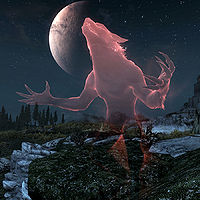
File:SR-creature-Pack_Member.jpg
I know that an image of a similar subject was nominated as FI and passed its nomination, so if you want to shoot down this nomination on the grounds that a different image of the same subject was FI'd then so be it. However, I thought this image was glorious, and it is everything that the other FI isn't, IMO. It's a shame that this image wasn't uploaded until seven months or so after the other image's nomination.
Anyway, this is another image of Psylocke's that I like (yes, I might sometimes get bored and look at her album since she takes such beautiful images and is my favourite photographer). Let's hear some opinions: FI worthy?
- Support: Nominator -damon xoxo 02:58, 2 October 2013 (GMT)
- Support: Just too cool to not be an FI, even if a similar image was already approved. --Xyzzy Talk 03:35, 2 October 2013 (GMT)
- Support: Holy freakin.. omg wow... I remember voting for the other pic long ago, and i was quite taken aback and captivated when i saw the other pack member... but this... THIS pack member really blows me away! the sky, the stars, the moon, the CLAWS. and i especially like the positioning, it reminds me of the werewolf perk tree!--Honeystars (talk) 12:14, 2 October 2013 (GMT)
- Support: Fantastic. • JAT 21:57, 2 October 2013 (GMT)
- Support! ...wow, just wow. --¿Vulpa? 00:36, 3 October 2013 (GMT)
- Support: Yep..... Schiffy (Speak to me|What I've done) 03:59, 4 October 2013 (GMT)
- Support This pic ROCKS! --Dotto88 (talk) 00:15, 11 October 2013 (GMT)
- Oppose: Just out of principle. I don't like featuring similar images again. This is a terrific shot, but we should try to mix it up a little if we're featuring images for so long. This one is near-identical to the wolf image we put up back in summer. —Legoless (talk) 15:11, 12 October 2013 (GMT)
| Consensus: Support. Seven supporting with one opposing opinion. --AKB Talk Cont Mail 21:08, 14 October 2013 (GMT) |
File:SR-quest-A Daedra's Best Friend 04.jpg
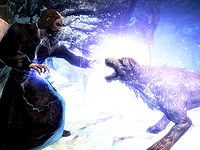
Similar to this image, I chose to nominate this one because I feel it's better (but perhaps the other one will be preferred over this one, we will see). They caught my eye, they're those kind of spectacular shots that may or may not be preferred. But I think this one looks great, it shows well how Barbas is no mere dog, a good shot of the heat of a battle. Think this deserves a spot on the main page for a while?
- Support: As nominator ~ Dwarfmp (talk) 18:23, 30 September 2013 (GMT)
- Support: This is probably the only image of Barbas that really shows off the importance of the character. Capturing a side of a character that Bethesda didn't do much to explore is truly spectacular. --AKB Talk Cont Mail 18:34, 30 September 2013 (GMT)
- Support: Looks good as a thumbnail and great full size. I especially like their expressions. --Xyzzy Talk 20:15, 30 September 2013 (GMT)
- Oppose: The expressions are awesome, and the action in the shot is remarkable. But the spell effect makes the whole image too bright for my tastes. :/ --Nocte|Chat|Look 21:45, 30 September 2013 (GMT)
- Oppose: Too much light and exposure. :(--Tiberseptim2 (talk) 22:59, 30 September 2013 (GMT)
- Oppose: Definitely no. Left part is dark, center and right part way too bright. Its okay as a thumb, but when enlarged, the pic is huge and makes that exposure even more glaring.--Honeystars (talk) 01:50, 1 October 2013 (GMT)
- Oppose: What they said. -snowmane xoxo 19:17, 1 October 2013 (GMT)
- Support: Barbas being electrocuted ... I can get behind that. Minor EditsThreats•Evidence 19:45, 1 October 2013 (GMT)
- Support: I like it. The image does a great job of capturing the scene of the battle. While the effect of the spell is pretty bright, it makes the image stand out and really grab the attention of the viewer (at least, in my case it did). Forfeit (talk) 21:31, 1 October 2013 (GMT)
- Support: I think we can all sympathize with wanting to incinerate Barbas at some point! I love the expressions on their faces, too - it really heightens the drama of the shot. KitkatTalk•Contrib•Email 22:05, 1 October 2013 (GMT)
- Oppose: I much prefer the second image, where the mage seems to be electrocuting Barbas so bad he flies back and yelps in pain!! Err, this one just looks like a generic combat screenshot, nothing spectacular. Weroj (talk) 13:23, 2 October 2013 (GMT)
- Oppose: The subject is great, but the composition could stand to be better. The extreme dark-light contrast is what puts me off. • JAT 21:57, 2 October 2013 (GMT)
- Support: I think it looks better at full size than as a thumbnail, but regardless I love it. The spell effect, their expressions, fantastic. Like Dwarfmp said, the image captures the heat of the battle. — ABCface◥ 04:42, 4 October 2013 (GMT)
- Support: The confrontation, the diagonal axis and the effects. --MortenOSlash (talk) 05:27, 4 October 2013 (GMT)
- Oppose: Well, it pains me a little to oppose an image by a photographer I admire, but I can see the concerns of the opposing party (sorry Holomay!). I agree that the composition of this combat shot is good, with their expressions and all, but it is the extreme bright-dark contrast that upsets the image. I'd rather have that lightning spell to be something like in this image (also by Holomay), where the spell effect looks better IMO, and the contrast and lighting is good. ~ Psylocke 08:30, 5 October 2013 (GMT)
- Support: Excellent eye-catching image – and Barbas deserve some love! --Krusty (talk) 15:05, 12 October 2013 (GMT)
- Oppose: I'm in the contrast bandwagon. —Legoless (talk) 15:09, 12 October 2013 (GMT)
| Consensus: No Clear Consensus. Nine supporting the image, with eight opposed. --AKB Talk Cont Mail 21:08, 14 October 2013 (GMT) |
File:DB-quest-Old_Friends_02.jpg
Another Dragonborn screenie to compliment the nomination above. I saw this picture awhile ago and instantly fell in love. Now that there aren't 3 nominations going on at once, I figured that it was time to whip this one out. Intriguing and inviting as a thumbnail, clicking on the image for the full size reveals a highly detailed shot of three creepy looking dudes on the attack. The sky in the background really gives this image an appropriate vibe.
- Support: Obviously...•WoahBro►talk 23:30, 19 September 2013 (GMT)
- Support: Opposite case to the Gyldenhal Barrow nomination, this looks meh as a thumbnail, but their facial expressions and poses are excellent close-up. I really like this. Weroj (talk) 00:18, 20 September 2013 (GMT)
- Support: Yeah, that's a pretty iconic image for this quest. Schiffy (Speak to me|What I've done) 18:03, 22 September 2013 (GMT)
- Support: Very interesting image, plus they kinda look like my father-in-law. --Xyzzy Talk 18:20, 22 September 2013 (GMT)
- Support: I am now very scared of Xyzzy's father-in-law. Minor EditsThreats•Evidence 18:48, 22 September 2013 (GMT)
- Support: nice poses, those ash spawn look pretty badass. i'm really liking the detail here, from the ash spawn with sword and spell in hand, to the mushroom buildings of tel mithryn at the back.--Honeystars (talk) 10:05, 23 September 2013 (GMT)
- Support: Nice to see Morrowind in HD!!--Tiberseptim2 (talk) 05:05, 24 September 2013 (GMT)
- Comment: As image uploader. Great that you guys like my image; I like taking action shots. Be sure to bring back an amusing story of how Ildari died. ~ Psylocke 03:27, 27 September 2013 (GMT)
| Consensus: Support. Fully supported by all participants. --AKB Talk Cont Mail 15:04, 28 September 2013 (GMT) |
File:DB-place-Gyldenhul Barrow.jpg
I don't do many nominations for FIs or FAs, but when I was idly glancing at pages on the RC, I saw this image open in it's respective page, and I had a "Wow, that's gorgeous" moment. I just love this image. It's a typical low angle location image, but Masser and Secunda sold me on it. I just love it! The lone sentry standing guard, the twin moons hanging overhead, and all the little details around the image. It's wonderful!
- Support: Would a nominator be opposing his own nomination? -snowmane xoxo 19:28, 19 September 2013 (GMT)
- Support: Yup, the beauty of Skyrim captured perfectly, even on Solstheim. :) --Krusty (talk) 20:26, 19 September 2013 (GMT)
- Support: I know there's a lot of Skyrim(/Dragonborn) images on the wiki which capture beautiful nighttime details like these moons, and some might argue against that for this reason. But personally, I don't think this shot should lose any points based on that sort of thing. It's an absolutely fantastic image, and it's definitely worth featured status by its own quality. — ABCface◥ 21:46, 19 September 2013 (GMT)
- Oppose: There are much more stunning Skyrim night shots out there. All I see here is a dark ruin with some particularly sharp moons in the background and a bandit out front. —Legoless (talk) 23:03, 19 September 2013 (GMT)
- Oppose: Looks good as a thumbnail, but really mundane in full size. Weroj (talk) 00:18, 20 September 2013 (GMT)
- Support: The contrast between the bright and dark areas gives this image a very cool appearance. --Xyzzy Talk 18:22, 22 September 2013 (GMT)
- Oppose: the moons and starry sky are a nice touch, but i think the ruins can be bit brighter and possibly sharper to giv the image more detail.--Honeystars (talk) 10:00, 23 September 2013 (GMT)
- Support: I really like this. The lone sentries guarding the ruins on a starry night is what does it for me. • JAT 22:29, 24 September 2013 (GMT)
- Comment:
As epic photographer of night shots.. I mean.. as image uploader. Nah, I won't vote; that kinda feels wrong :P. My other image is getting plenty of supports anyway. BTW, no one noticed him yet? You guys keep talking about that lone sentry. There's actually one more nicely camouflaged with the wall by the door. Sneak level: Asian :D ~ Psylocke 16:36, 25 September 2013 (GMT)- Reply: Sonuva...... that takes some serious squinting to notice him. Nice, Psylocke. Real nice. Schiffy (Speak to me|What I've done) 11:45, 27 September 2013 (GMT)
| Consensus: No Clear Consensus. Five Supporting to Three Opposed. --AKB Talk Cont Mail 15:04, 28 September 2013 (GMT) |
File:SR-quest-Lost to the Ages.jpg
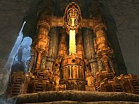
I really like this image of the aetherium forge. Its an example of how complicated some dwemer mechanisms are, and Katria's blue ghost really shows some contrast, making the image stand out.
- Support: As nominator. Silence is GoldenBreak the Silence 00:35, 11 September 2013 (GMT)
- Support:I do love the colors in this image, and I love how the Dwemer statue seems to be peering down. It's a yes from me. Mog Mog Player 06:06, 11 September 2013 (GMT)
- Oppose: While I don't know this quest or what that ghost is doing or supposed to be doing, I still am not a fan. The ghost is looking off in a way that doesn't appear to be towards the subject of the picture, and the ghost's presence makes the picture feel awkward to me. If the ghost wasn't there, or was there, and had a function to supplement the image better, than it would be an awesome pic, but right now, it falls short for me. Ghost aside, I like the lighting on the Aetherium Forge. Looks gorgeous. ES(talk•email) 20:44, 12 September 2013 (GMT)
- Oppose: As a thumb, it looks kind blurry on my screen, and at full size, it looks jaggy. I don't mind the ghost per se, but I do mind how off-centered the forge is in the image in order to include the ghost. Minor EditsThreats•Evidence 23:17, 13 September 2013 (GMT)
- Oppose: The lighting of the forge is good, but the ghost kinda spoils the img, doesnt contrast at all imo. Also, while the low-angle looks good, it is slightly angled to the left (ie its not from the center, your looking upwards but from slightly to the left of the forge). This throws off the symmetry, and not to mention the ghost which makes this more obvious.--Honeystars (talk) 12:54, 17 September 2013 (GMT)
- Oppose: Eh, the mechanism itself is cool, but the screenshot isn't especially fantastic, in my opinion. I know it's not easy to get a good 4:3 screenshot of something like this, which is a limitation we ourselves put on this sort of image, but either way, it's not what I'd call FI-worthy. — ABCface◥ 21:46, 19 September 2013 (GMT)
| Consensus: Oppose. Two supporting to four opposed. --AKB Talk Cont Mail 22:47, 19 September 2013 (GMT) |
File:SR-quest-Lost to the Ages 02.jpg
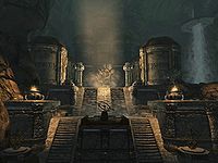
Compared to the striking image above, this is full of understated beauty. From the light designed to highlight the organic tree amongst its man-made surroundings, to the waterfall to the right, to the way the image shows how big the place is, I can't get enough of it.
- Support: As nominator. Silence is GoldenBreak the Silence 00:35, 11 September 2013 (GMT)
- Support: The air of former power and glory is so apparent in this picture. —MortenOSlash (talk) 05:05, 11 September 2013 (GMT)
- Support: Is it just me or is this image slightly poor quality? However the lighting is good, I enjoy the symmetrical look this image has, with the stairs leading up to a darkened and shadowy looking building. However another aspect that i do not enjoy about the image is the waterfall in the top right corner, as it looks as if it is falling out of the bottom of a flat platform? That I can't understand, but its not enough to deter me from giving this image the thumbs up. Mog Mog Player 06:06, 11 September 2013 (GMT)
- Oppose: Oh, wow, this is a tough thing to say to such a gorgeous image, but here it is: This image doesn't feel remarkable. To be honest it feels like a "safe" image, for lack of a better term. It's rather reminiscent of this image, which came to mind when I saw it. Don't get me wrong though, it's a beautiful image that shows off its subject wonderfully, I just don't want to see the same style (low light with a well lit center of the room) of image a few times in FIs, because the more there are, the less unique and beautiful each one becomes, IMO, and FIs need to stand out. ES(talk•email) 19:49, 12 September 2013 (GMT)
- Support: Serene yet ominous. Very cool. Minor EditsThreats•Evidence 23:17, 13 September 2013 (GMT)
- Oppose: Lighting is quite bad. I know the point of this img is to highlight the tree, but the dark parts can obviously be made much brighter (btm part and the 4 corners, basically all around the lightbeam). The temple of talos img ES gave is a good example, and so is this. Also, this img has high resolution, but poor quality and detail (bad combination imo). Im also not a fan of the rock wall to the left, kinda makes the other side feel "empty."--Honeystars (talk) 13:10, 17 September 2013 (GMT)
- Support: For once I don't really have an explanation... I just like the lighting a lot, I guess. :P It's nice as a thumb, but when clicked on (which is what we want viewers to do) it's beautifully lit. I must say however that I don't like either the water or the left wall very much when expanded... too choppy. The second linked image is quite nice as well-- whaddya know, I found a lot to say anyhow. xD --¿Vulpa? 01:59, 18 September 2013 (GMT)
- Support: What Vulpa said. Very... zazzy. KitkatTalk•Contrib•Email 11:50, 18 September 2013 (GMT)
- Support: I absolutely love this image. It reminds me of the very first time I entered this location and saw this place, every single time I see it, and every single time I'm happy about that. That's an excellent thing for an FI to do- take you back to how you feel when playing. — ABCface◥ 21:46, 19 September 2013 (GMT)
| Consensus: Support. Seven supporting to two opposed. --AKB Talk Cont Mail 22:47, 19 September 2013 (GMT) |
File:BS-Soul Cairn Burial Chamber of an Ideal Master.png
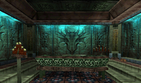
I think it's time to have an oldie for a FI. We have been in the soul car in before and I think the The battle spire SC looks just amazing! I believe it's time for something older than morrowind.
- Support - As nominator--Tiberseptim2 (talk) 04:53, 29 August 2013 (GMT)
- Oppose: I am not one to dislike old games. In fact, they tend to have more character than newer games. But this image just does not do it for me. There is nothing special to it, nothing exciting. So I have to oppose it. --Nocte|Chat|Look 05:08, 29 August 2013 (GMT)
- Support: The light setting makes it look good. --MortenOSlash (talk) 05:09, 29 August 2013 (GMT)
- Oppose: Simply unremarkable. There's nothing going on here, nothing that draws the eye, nothing. — Unsigned comment by WoahBro (talk • contribs) at 11:29 on 29 August 2013
- Support: Although there isn't any action in the image or anything that sticks out, the image does a great job at capturing the image of the burial chamber as a whole. I agree that the lighting helps add to the image, giving it a somewhat mysterious or eerie atmosphere, and I like the candles on each side of the tomb; they add a sort of symmetry to the image. And looking at some of the other images in the Battlespire namespace, this one just sticks out to me more and it doesn't suffer from having an onscreen display or a very low resolution like many of the other images in that namespace. Forfeit (talk) 15:53, 29 August 2013 (GMT)
- Oppose: My problem here is that you have to reallllly look at the full size image to find anything interesting about it, like that eery sense or remembering the quest it was involved with. With a glance at the thumbnail, all I get out of it is, "Okay, so what?" That's the approach most people will have when they look at the front page; that's a place for images that are outstanding or bold, or that make you want to play the quest again, or that picture a memorable moment... An image of an empty, somewhat blurry room doesn't cut it. Having an oldie is fine, but it really has to be a goodie, not just there for the sake of featuring an older image. --¿Vulpa? 19:07, 29 August 2013 (GMT)
- Support: I think the subject is more relevant than the age of the game being shown. However, they both cast a nice eerie feeling over the image. I've never played Battle Spire, but the fact this image is the closest I've come to seeing an Ideal Master (something so mysterious from a playthrough of the Soul Cairn in Skyrim) makes this interesting to look at. I find myself wondering what happens next. --SlyKhajiit (talk) 16:43, 3 September 2013 (GMT)
- Oppose: Good lighting, but there is nothing special here. nothing in the pic wows me.--Honeystars (talk) 04:32, 5 September 2013 (GMT)
- Oppose: Yeah, I know, Ideal Master and so on, but the only thing that tries to draw my attention is that dragon head carving on the back wall, and even this is nothing special... It's just to boring in my opinion. -- SarthesArai Talk 18:08, 5 September 2013 (GMT)
- Support: Open your eyes, people. You're not going to get a better Battlespire image. Stop comparing this to recent games, and compare it to its own game ~ Dwarfmp (talk) 18:44, 5 September 2013 (GMT)
- Support: I just looked through every single image we have on the wiki for Battlespire, and I gotta say I agree with Dwarfmp. This user screenshot is as good as it gets for this game. — ABCface◥ 19:20, 5 September 2013 (GMT)
- Support: Viewed as a full image, it's crap. As a thumbnail, though, it's eye-catching, and that's the format most will see it in. I stated in a previous nomination that I didn't think there were any images before Morrowind which were good enough to be FIs. But, if Dwarf and ABC are satisfied that this is the best possible Battlespire image, then I guess it deserves a two-week spotlight. Minor EditsThreats•Evidence 21:19, 5 September 2013 (GMT)
- Support: I've been on the fence for a while on this image, but at the end of the day I keep coming back to it and thinking "that looks pretty neat". It's also pretty much the best screenshot you'll ever get of Battlespire period. • JAT 01:56, 6 September 2013 (GMT)
- Comment:To those who say that some of us oppose this image simply because it's not of the "higher" quality images in the newer games: We just find this picture boring. There's nothing significant here that would be FI quality. Frankly, for images of Battlespire places, I like this one much better because the lighting is makes objects clearer and you can actually see something that people know and may be curious about. •WoahBro►talk 01:57, 8 September 2013 (GMT)
- Comment: I'm not going to vote, since I haven't been active in months - I'll just throw in my two cents. If I had to pick a side, I'd oppose this image. No, not because it's Battlespire - I love the old games. I'd oppose it because it's (to put it bluntly) dull. Where's the sparkle? The "eye catching, wow that's awesome!" moment potential FI's should always have? It's... A room. A tomb in a room. A blurry room. To those of you saying this is the best Battlespire has to offer, how about this image? Forget speaking in terms of games, that's one of my favorite on the entire site - the blurriness looks almost intentional, like it's a demonic oil painting or something. Or this image (not used on a page, I know - just an example). This one is pretty cool, too. Those last two can't be featured for various reasons, but that's beside the point, I think. The current nomination isn't the most fantastic representation of just how much the older games can shine when given the chance. KitkatTalk•Contrib•Email 09:45, 8 September 2013 (GMT)
- Oppose: I'll have to oppose this image as well. Yes, I know, I've been spoilt by Skyrim. But that aside, and comparing just within its own game, this image is rather dull and boring, and pretty much whatever the opposing party mentioned. I agree with Kitkat's comments; there are other images that are pretty neat, like the first two that Kitkat suggested. ~ Psylocke 06:08, 11 September 2013 (GMT)
| Consensus: No Clear Consensus. 8 Supporting to 6 Opposed. --AKB Talk Cont Mail 19:38, 12 September 2013 (GMT) |
File:SI-quest-Everything In Its Place 2.jpg
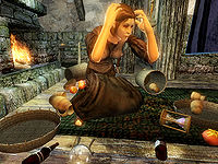
I am nominating this image on the basis that I believe it captures the essence of the insanity of one many of the poor souls who call the Shivering Isles their home. The images brilliantly shows a twisted, insane personality who has lost their mind. It portrays chaos. I especially love the beady eyes!
- Support: As nominator.--Mog Mog Player 13:08, 24 August 2013 (GMT)
- Support: I would make a comment about the way she's positioned, but that's just because Oblivion character models were kind of meh. That aside, I agree with Mog, it really is an iconic picture of a Shivering Isles resident. Schiffy (Speak to me|What I've done) 13:50, 24 August 2013 (GMT)
- Support: I like it. --Xyzzy Talk 15:05, 24 August 2013 (GMT)
- Oppose: Her facial expression is the complete opposite of her body language. It just doesn't work like this. I've got to say I like the previous version of this picture a lot better on that part. I also don't like the centering at that ~ Dwarfmp (talk) 17:17, 24 August 2013 (GMT)
- Support: Yes! I loved that ending of the quest, wrecking her place was almost as fun as her reaction. >:D Also, I have to add that I like the way her face is; it's sort of an expression of deadened despair when you add her gesture and posture into it. --¿Vulpa? 21:57, 24 August 2013 (GMT)
- Support: I remember this quest! I felt so bad for moving all of her stuff. After I beat the quest I cleaned it back up for her. --Nocte|Chat|Look 23:31, 24 August 2013 (GMT)
- Support:"Wah, such a chaos, what should I do?" -- SarthesArai Talk 16:11, 25 August 2013 (GMT)
- Support: I like it! • JAT 03:25, 26 August 2013 (GMT)
- Support: Great imge, reminds me of Glathier!--Tiberseptim2 (talk) 08:06, 26 August 2013 (GMT)
- Support: i like the composition of this image. it depicts that part of the quest very well. the image has high detail and good lighting.--Honeystars (talk) 10:49, 26 August 2013 (GMT)
| Consensus: Support. 9 - 1 ~ Dwarfmp (talk) 11:30, 4 September 2013 (GMT) |
File:BM-place-Iggnir River.jpg
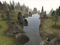
I've always liked this image. I'm a sucker for Morrowind water generally, and my case of nostalgia is so bad it can cause rashes, but I think this is a truly idyllic portion of Solstheim in Bloodmoon that was captured beautifully. It's just far away enough that the grass and ground doesn't appear painted on, and I feel that all the elements come together to evoke a feeling of serenity. And look, Horkers! Back when they looked like seals instead of walruses. Good times.
- Support: As nominator. Minor EditsThreats•Evidence 22:36, 22 August 2013 (GMT)
- Support: Favourite place on Solstheim pre-ash. —Legoless (talk) 21:47, 23 August 2013 (GMT)
- Support: such deep lush forest with a nice respectable mist. Great!--Tiberseptim2 (talk) 23:08, 23 August 2013 (GMT)
- Support: I like it, it is a stunning shot. This shot captures the essence that Solstheim gave to Morrowind players; a lush, green, crisp and ashless environment ! Solstheim was truly 'sexy' pre-ash. Also those woods in the top left of the image seem to be luring me into them. It's a yes from me! --Mog Mog Player 12:43, 24 August 2013 (GMT)
- Support: Beautiful. I love Morrowind. --Nocte|Chat|Look 23:31, 24 August 2013 (GMT)
- Support: Nice shot! You can even see some horkers in the river. -- SarthesArai Talk 16:11, 25 August 2013 (GMT)
- Oppose: It's definitely a good landscape shot by Morrowind standards, but other than its relative quality it doesn't really have anything going for it. There's trees, rocks, a river, and a couple of horkers, and that's pretty much it. Other than the horkers (which is a neat detail) the view and thus the image is rather unremarkable. • JAT 03:25, 26 August 2013 (GMT)
- Oppose: I have to agree with Jak, that there are possible to get better landscape shots in Morrowind than this. Other that that it is good to see a green Solstheim and not the ashy grey. --MortenOSlash (talk) 05:18, 26 August 2013 (GMT)
- Oppose: Im with Jak Atackka on this one. True, the landscape is nice, but there is nothing spectacular about it. Colours look a little dull too.--Honeystars (talk) 10:43, 26 August 2013 (GMT)
- Oppose: I've been on the fence about this one, but I'm going to have to agree, it's sort of just there. It's a river with some rocks and some horker. It just doesn't seem like a Featured Images shot to me.--Br3admax (talk) 11:22, 26 August 2013 (GMT)
- Oppose: I have never played Morrowind before, and I must say, this is a nice panorama of Solstheim's pre-ash landscape, but alas, echoing Jak, the image is rather unremarkable. ~ Psylocke 15:44, 26 August 2013 (GMT)
- Oppose: I appreciate the nostalgia value of the scene, but just don't see anything about it that makes it FI-worthy, IMO. It's just a nice image of one of the few pleasant places on Solstheim from Bloodmoon. --Xyzzy Talk 17:14, 26 August 2013 (GMT)
| Consensus: No Clear Consensus. Six supporting to six opposed. --AKB Talk Cont Mail 18:01, 30 August 2013 (GMT) |
File:SR-npc-Lord_Harkon.jpg
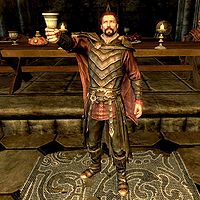
Dunno what it is about this image, whether it's the raising of the goblet, the Potion of Blood behind him, or the pose in general, but I believe this image is well deserving of featured status.
- Support - As nominator Schiffy (Speak to me|What I've done) 05:56, 21 August 2013 (GMT)
- Oppose: I am afraid I find the pose a bit stiff and unnatural. --MortenOSlash (talk) 15:26, 21 August 2013 (GMT)
- Oppose:Im going to have to oppose this as well. while the image has high resolution, its just too..yellow, and some parts are dark. Also, the half-visible Orthjolf kinda ruins it. Perhaps a different angle and better lighting/colouring wld be better.--Honeystars (talk) 05:29, 22 August 2013 (GMT)
- Oppose: Unremarkable. --Xyzzy Talk 06:18, 22 August 2013 (GMT)
- Oppose: All of the above.(except the nomination of course)--Br3admax (talk) 17:42, 22 August 2013 (GMT)
- Oppose: Again, all of the above-- plus, the throne behind Harkon looks awfully odd in the thumbnail... like a weird half-crown or something. --¿Vulpa? 21:27, 22 August 2013 (GMT)
- Oppose: Not digging the background. It almost looks like Daggerfall-quality jaggy pixels at parts. Minor EditsThreats•Evidence 22:36, 22 August 2013 (GMT)
- Oppose: Having the other NPC in the background ruins the image for me. --Nocte|Chat|Look 23:31, 24 August 2013 (GMT)
- Oppose: Unremarkable. -- SarthesArai Talk 16:11, 25 August 2013 (GMT)
- Neutral: I actually quite like the pose and background, but this situation doesn't seem very remarkable, and as has already been stated there are quality issues. • JAT 03:25, 26 August 2013 (GMT)
- Oppose: Hmmm, nothing much to add on really.. pretty much what the others mentioned. ~ Psylocke 15:44, 26 August 2013 (GMT)
| Consensus: Oppose. Only supported by nominator. --AKB Talk Cont Mail 05:41, 29 August 2013 (GMT) |
File:SR-quest-Dragonslayer.jpg
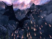
This shot really caught my attention for a number of reasons. Firstly, the action in it is unmistakable; secondly, the angle from which the shot was taken is very well thought out; thirdly, in keeping with the second reason, the composition of the shot, and more specifically the way Alduin's wings frame the top left area of the shot, give it a very well framed look, and fourthly, the shot manages to capture foreground, middle, and background very well. Its resolution and clarity, color balance, framing, and content are all FI material in my eyes.
- Support: As nominator. GodRaineTalk 23:39, 2 August 2013 (GMT)
- Support: How is this not already featured? That's amazing. --AKB Talk Cont Mail 23:42, 2 August 2013 (GMT)
- Support: Wow! Definitely FI-worthy! — ABCface◥ 23:52, 2 August 2013 (GMT)
- Support: Awesome image! Definitely does a perfect job of capturing the scene of the battle with Alduin. Forfeit (talk) 23:54, 2 August 2013 (GMT)
- Support: Awesomeness. --HalfStache 00:14, 3 August 2013 (GMT)
- Support Very very nice image! Awesome colours Mog 00:44, 3 August 2013 (GMT)
- Support: Wow..just, wow. --Xyzzy Talk 03:54, 3 August 2013 (GMT)
- Support: This image is awesome. This has the "WOW" factor I was looking for. --Nocte|Chat|Look 03:56, 3 August 2013 (GMT)
- Support: [Insert profanity-laced diatribe on how ****ing good this image is here]. Minor EditsThreats•Evidence 08:05, 3 August 2013 (GMT)
- Support: No explanation necessary here; just count me in for the 'support' team. --¿Vulpa? 20:54, 4 August 2013 (GMT)
- Support: Yup! --Krusty (talk) 22:11, 8 August 2013 (GMT)
- Support: It's not *that* good... But it's okay. =] Weroj (talk) 02:58, 9 August 2013 (GMT)
| Consensus: Support. Supported by all participants. --AKB Talk Cont Mail 19:45, 10 August 2013 (GMT) |
File:DB-place-Edla's_House.jpg
I came across this image, and it caught my eye - something about this image seems soothing to me, resulting in me liking the image. No there is no battle scene or monster in this image to give it a 'great' factor, but I believe that what makes this image great is the cozy feeling I get when looking at this house, it reminds me of home. This image is peaceful and calming. I also think shadowing and lighting are brilliant here. It also looks good in both thumbnail and full-screen. I believe it is worthy to make the home page - what do you guys, gals and Dragonborns think ?
- Support: As nominator.--Mog 04:48, 30 July 2013 (GMT)
- Oppose: What do I think? That it's a house covered in snow that looks identical to virtually every other house in the game. What makes it more special than the picture of the house across the street? The sunset is pretty, but it's just not FI material, IMO. ES(talk•email)
- I agree, the house looks like any other house, but its the image of this house with this lighting ect that makes it special, not the house but the image of the house - if that makes sense - but I understand your point of view --Mog 05:09, 30 July 2013 (GMT)
- Support: That’s more like it! An image of an ordinary house, but with that special ES magic captured perfectly. Mog is right - this feels like home for some reason and is brilliantly composed, especially the shadows along the roof(s). Looks great as a thumb as well, so I’d have zero problems with this on the main page. --Krusty (talk) 07:24, 30 July 2013 (GMT)
- Thank you for the positive feedback! I'm pleased you see it my way, I was worried not many people would see where I was coming from, thanks again --Mog 07:30, 30 July 2013 (GMT)
- Support: I like it. —Legoless (talk) 17:15, 30 July 2013 (GMT)
- Support: The snow on the roof looks a bit weird, but this is still very idyllic. I'm supporting this for that reason, and for being somewhat unusual for a Featured Image nomination. Weroj (talk) 19:06, 30 July 2013 (GMT)
- Neutral: I like the image, but I agree that it is somewhat unremarkable. I'm not familiar with Dragonborn, but I took a look at some of the other images of the homes in the same town as this one. While I would say that I liked this image more than the other images I looked at, it still wasn't remarkably better than the other images. This being said, I really can't bring myself to oppose the image as it is quite nice for just being a standard house picture. Forfeit (talk) 19:23, 30 July 2013 (GMT)
- Support: First of all, good job Mog on the nomination. ;) Second, I like it! You're right, it feels... cozy... which is a rare feeling in Skyrim with all the things that want you dead. I can't tell what the best part is: how the light falls on the house and its surroundings, or the fact that it so beautifully represents a less-seen side of the game. — Unsigned comment by Vulpa (talk • contribs) at 20:47 on 30 July 2013 (GMT)
- Thank you ! Mog (Talk) Mog Player 22:00, 30 July 2013 (GMT)
- Oppose: It just seems so... bland. I know that's the point, but it just doesn't really work for me. --HalfStache 00:16, 3 August 2013 (GMT)
- Oppose: I must admit to cheating. I knew this nomination was coming, because Mog asked about it on the talk page, so I spent a lot of time thinking about it. I really like the image, but I simply cannot see it as an FI. When I look at a nomination, I think about how the image would look on the front page. Quite frankly, a picture of a house just does not cut it for me - it does not have that "WOW" factor that I like. An FI, in my opinion, should draw a potential new editor into the wiki, and this one does not have what it takes. I must admit this took a lot of thought, though, because it IS a beautiful image. --Nocte|Chat|Look 00:50, 3 August 2013 (GMT)
- Support: In the midst of all the monsters and action shots, this is a breath of cold fresh mountain air. --Xyzzy Talk 03:54, 3 August 2013 (GMT)
- Support: It's the texture of the snow on the roof that I think really makes it stand out. It's kind of a one-trick pony, but it looks good enough to have two weeks in the spotlight. Minor EditsThreats•Evidence 08:05, 3 August 2013 (GMT)
| Consensus: Support. Seven supporting to three opposed. --AKB Talk Cont Mail 15:13, 6 August 2013 (GMT) |
File:SR-quest-The Battle for Fort Amol.jpg
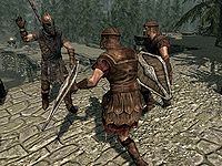
This image was very recently uploaded, and it is definitely a good one. I like the way the image manages to capture the action, and just by looking at it I can feel the tension on the battlefield.
- Support: As nominator. --Nocte|Chat|Look 01:10, 30 July 2013 (GMT)
- Oppose: The angle has potential, but hand up as if to wave and no visible arms (that I can find at least) leaves something to be desired, in my opinion. This image just doesn't give the emotion it's supposed to. ES(talk•email) 01:18, 30 July 2013 (GMT)
- Oppose: The moment it captures does seem awkward. Not really FI-worthy, IMO. --Xyzzy Talk 02:18, 30 July 2013 (GMT)
- Oppose: Unremarkable. Weroj (talk) 19:06, 30 July 2013 (GMT)
- Oppose: This is a pretty good image, but it is not Featured Image material. If the Stormcloak soldier's hand was on the weapon or he was wielding the weapon, that would have made it a better image. Even if that was so, the image would still lack that wow factor to make it worthy of being a Featured Image. Forfeit (talk) 19:23, 30 July 2013 (GMT)
- Oppose: You don't normally see shields at that angle in screenshots, but while unusual, it's not particularly good. I don't see much in the image that's noteworthy, and the one big problem I have is that the Imperial soldier looks like he has only one leg. Minor EditsThreats•Evidence 08:05, 3 August 2013 (GMT)
| Consensus: Oppose. Opposed by all but the nominator. --AKB Talk Cont Mail 15:13, 6 August 2013 (GMT) |
File:SR-quest-Robber's Gorge.jpg
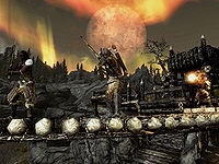
Quite possibly the best action shot we have on the UESP.
- Support: As nominator. Minor EditsThreats•Evidence 20:20, 25 July 2013 (GMT)
- Oppose: The crazy northern lights in the background kind of take the focus away from the bandits. There are better action shots of Skyrim NPCs, such as this and this. The lighting in this one is a little too strange. —Legoless (talk) 20:25, 25 July 2013 (GMT)
- Oppose: First of all, the one with the sword looks far too wooden. She actually looks a little distracted, too... Also, the pointed ends of the planks on the bridge are far too prominent; they're bright enough, large enough, and centered enough to almost make one think they're the focus of the image. Couple that with the fact that the mage on the right would be invisible if not for the huge flame in front of his face, and I have to say no. Intriguing thumbnail, but not FI worthy IMO. --¿Vulpa? 21:09, 25 July 2013 (GMT)
- Oppose: What Lego said... Strange lighting ES(talk•email)
- Support: For the record, I requested the image to be just like this, with the moon and the lights, and the silhouettes of bandits. A magical moment for me in-game, and one worthy for the main page. --Krusty (talk) 21:36, 25 July 2013 (GMT)
- Support: I like it. That is my favorite Aurora Borealis, and the action shot is great. The image is a bit small, however. Still good, regardless. --AKB Talk Cont Mail 21:42, 25 July 2013 (GMT)
- Oppose: You need to look really close at the thumbnail to see what's going on in this picture. Also, your focus is drawn to the mage's flame and the aurora part at the top of the picture. Although it is acceptable at foll scale, the lighting is still strange. -- SarthesArai Talk 21:51, 25 July 2013 (GMT)
- Oppose:The face of the swordsman is in shadow and it's hard to see what exactly the mage is doing. The backround is great but the action is somewhat subpar imo. --AN|L (talk) 21:58, 25 July 2013 (GMT)
- Support: The background is great and the action shot is nice as well. Although the background does take away a little bit from the action, it's not a large enough concern for me to oppose the featuring of this image. Forfeit (talk) 22:04, 25 July 2013 (GMT)
- General comment: One person's "strange" is another person's "distinctive". The lighting is one of the things that separates the image from the pack. The bridge is a huge part of this particular slice of Skyrim; it's an integral part of the story being told. And I can't stress this enough: there's nothing wrong with darkness. An image need not be brightly lit, with every detail illuminated, for it to be a great image. There are a few regular FI voters who seem to think "shadow=bad", and for the life of me, I just cannot follow that logic. If we were voting on Van Gogh's Starry Night, I feel like some people here would chime in that the spire is too dark.
- Anyways, I agree the thumbnail must be scrutinized a little, but I don't see this as a problem for two reasons. First, I view thumbnails at 300px, I encourage everyone else to do the same, and I don't understand why our default thumbnail size is so frickin' small. It's just ridiculous. Our images should not be faulted for the failings of the site itself. Second, and more importantly, a FI is one which should encourage observers to look closely and then reward them for doing so. I think this image does so. Minor EditsThreats•Evidence 21:11, 26 July 2013 (GMT)
- Having a bad thumbnail isn't nearly a good reason alone to oppose an image, it's more of an extra reason to toss in. The image in full size is obviously much more important. I would expect bigger thumbnails to change the layout of text though. I just wanted to add this to your comment, just throwing it out there... ~ Dwarfmp (talk) 23:21, 26 July 2013 (GMT)
- Support: This is an awesome image. I really like the interplay between dark and light. Also, I agree with ME about 300px being the ideal size for thumbs. You should all do it. :> --Nocte|Chat|Look 22:32, 26 July 2013 (GMT)
- Support: I like the way the darkness let's the mage's fire spell really light up the caster's face. The nothern lights are really cool along with the moon. Not only is the back round awesome, but there's action in the picture. Not only that but the shadows add a feel of mystery. Over all it is a good picture. — Unsigned comment by Sparks of Light (talk • contribs) at 01:28 on 27 July 2013 (GMT)
- Support:The other action shots are great, but this one has that little extra "something" that sets it above. --Xyzzy Talk 03:06, 27 July 2013 (GMT)
- Support: I really like this image as well. The emphasis is obviously on the archer in the middle, and the way the aurora and other background elements work together to emphasize him is phenomenal. Also, the sky is pretty :P • JAT 21:38, 27 July 2013 (GMT)
- Oppose: SR uses those lights too much.--Tiberseptim2 (talk) 06:25, 28 July 2013 (GMT)
- Support: It's a decent action shot, but the crazy aurora and colours make this awesome. That bandit in the middle is the boss for getting to shoot at stuff with a background like that. Very cool! Weroj (talk) 19:06, 30 July 2013 (GMT)
| Consensus: Support. 9 - 6 ~ Dwarfmp (talk) 23:48, 2 August 2013 (GMT) |
File:SR-npc-Ulfric Stormcloak 07.jpg
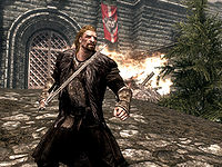
A wild Helena appears! Anyhow, I came across this image and thought it was exceptionally well accomplished image taken by Psylocke (no doubt). The reason why it caught my attention was how cinematic the image seemed to look, as well as Ulfric's positioning shows that he's ready to show the Empire and the Thalmor who's boss and kick some butt! :D
- Support: As nominator. -helenaanne talk ♥ 01:54, 5 July 2013 (GMT)
- Oppose: We already featured this image. —Legoless (talk) 02:23, 5 July 2013 (GMT)
- Comment: It's still not the exact same image, so you can't automatically rule it out based solely on that factor. Plus this one tells more of a different side of the story, whereas that image that has been previously nominated, although may be the same quest, holds a different view when you compare the two. -helenaanne talk ♥ 02:27, 5 July 2013 (GMT)
- Support: Awesome image. As to the previously features image mentioned above... Aside from them being about the same quest, I see no similarities between them --Nocte|Chat|Look 17:30, 5 July 2013 (GMT)
- Oppose: And the identical color pallet. I think featuring this image would be redundant. Plus, my eyes are more drawn to the fire behind Ulfric than to Ulfric himself. Probably because he's off-center and the fire is bright compared to him. --SlyKhajiit (talk) 23:27, 9 July 2013 (GMT)
- Oppose: I had to chew on this one for awhile, but came to the conclusion that the composition of the image isn't great. It's not bad, just not FI-worthy. --Xyzzy Talk 00:38, 10 July 2013 (GMT)
- Oppose: Psylocke does take some fantastic images, and while this is a good quality image, I simply don't see it as having that 'something extra' that an FI image should have. — ABCface◥ 00:55, 10 July 2013 (GMT)
| Consensus: Oppose. Four opposed to two supporting. --AKB Talk Cont Mail 00:20, 14 July 2013 (GMT) |
File:OB-creature-Minotaur Lord.jpg
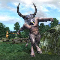
Here you can see the Whitgold Tower and a ML on a great day swinging his war hammer. great
- Support: as nominator.!--Tiberseptim2 (talk) 08:02, 3 July 2013 (GMT)
- Oppose: It's pretty low res and low quality. And I don't like nose piercings. -- SarthesArai Talk 13:55, 3 July 2013 (GMT)
- Oppose: The quality/resolution could be better and the image itself isn't all that remarkable. Forfeit (talk) 18:07, 3 July 2013 (GMT)
- Oppose: It does seem rather poor quality, doesn't it? The pose and subject is rather nice, but the distortion around the horns, assuming it's not some magical effect, and the overall fuzziness from the low resolution prevent me from supporting it. --Xyzzy Talk 19:19, 3 July 2013 (GMT)
- Oppose: Hm, it really isn't all that great of quality. That, and even though Oblivion had cartoon-y graphics, this is too cartoon-y for Oblivion. *WoahBro►talk 19:23, 3 July 2013 (GMT)
- Oppose: Per just about everything above. --Nocte|Chat|Look 08:02, 4 July 2013 (GMT)
- Oppose: As everyone else said, super blurry and low-res. No way this is an FI. --HalfStache 22:50, 4 July 2013 (GMT)
| Consensus: Oppose. Only supported by nominator. --AKB Talk Cont Mail 00:20, 14 July 2013 (GMT) |
File:SR-creature-Otar_the_Mad.jpg
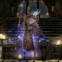
I came across this picture and noticed that it is possibly FI material. I personally appreciate the light-dark contrast around Otar with his magic and the overall quality of the shot.
- Support: As nominator. --SlyKhajiit (talk) 15:32, 2 July 2013 (GMT)
- Support: For the shivers down my spine. Silence is GoldenBreak the Silence 17:33, 2 July 2013 (GMT)
- Support:Spooky. The magic aura is very cool, but it's the glowing skull eyes on the coffin that really clinch it for me. --AN|L (talk) 17:35, 2 July 2013 (GMT)
- Support: My favorite part is the glowing eyes on the coffin. Minor EditsThreats•Evidence 17:44, 2 July 2013 (GMT)
- Support: Okay, this image is really cool. And I'll be the third to say I LOVE the glowing coffin eyes. --Nocte|Chat|Look 17:59, 2 July 2013 (GMT)
- Support: Best looking NPC ever!--Tiberseptim2 (talk) 21:06, 2 July 2013 (GMT)
- Support: Absolutely brilliant! --Krusty (talk) 23:09, 2 July 2013 (GMT)
- Support: I'm scared! Somebody hold me... --Xyzzy Talk 04:04, 3 July 2013 (GMT)
- Support: This almost makes me embarrassed about my nomination. The glowing eyes on the coffin really seals it for me. *WoahBro►talk 04:30, 3 July 2013 (GMT)
- Support: It's a great shot. The Sparks arround Otar, the glowing eyes and the relatively dark background are great contrasts. -- SarthesArai Talk 13:55, 3 July 2013 (GMT)
- Support: Per what everyone else has already stated. Forfeit (talk) 18:07, 3 July 2013 (GMT)
- Support: Yep. —Legoless (talk) 20:07, 3 July 2013 (GMT)
- Support: That is possibly the best looking magic aura stuff I've seen from Skyrim. --HalfStache 22:48, 4 July 2013 (GMT)
- Comment: Looks like my third FI nomination is the charm. --SlyKhajiit (talk) 17:18, 5 July 2013 (GMT)
| Consensus: Support. Fully supported. --AKB Talk Cont Mail 00:20, 14 July 2013 (GMT) |
File:BM-place-Solstheim.jpg
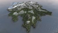
I happened to find this and I haven't seen a picture like this in...well quite awhile. Anyways, I find it very neat to see the entire island of Solstheim and various locations. It's unique, complete, and pretty good quality for a MW screenshot.
- Support: As nominator. *WoahBro►talk 01:42, 2 July 2013 (GMT)
- Comment: I love it, but I believe that it is typical policy to not feature images that use mods. Please correct me if I'm wrong, but that certainly looks like it has draw-distance enhancement mods. --HalfStache 01:49, 2 July 2013 (GMT)
- Comment: Hm, that could be true, but couldn't it also be console commands? The only person who may really know would be the photographer, which would be Rpeh, who I don't believe has been around for awhile... *WoahBro►talk 01:52, 2 July 2013 (GMT)
- Comment:If you look here, he does in fact use a graphics mod which includes a draw distance extender, and some of his other Morrowind shots use it as well. Again, great image, but I don't think it fits regulations. I also don't believe that console commands could be used to effect the graphics in Morrowind (at least not to that extent). --HalfStache 05:40, 2 July 2013 (GMT)
- Oppose:I like the image, but it is just not something I can see as an FI. I like FIs to make me think "Wow" when I see them, and this one just did not do it. --Nocte|Chat|Look 04:09, 2 July 2013 (GMT)
- Comment: How can you look at the full size image and not think "wow"? If it doesn't violate policies, I'd support it. Unfortunately, I think you're right in that it can't be an FI because of the mod, which is a cryin' shame. --Xyzzy Talk 05:48, 2 July 2013 (GMT)
- Support: Love the view! Can't get better.--Tiberseptim2 (talk) 07:02, 2 July 2013 (GMT)
- Oppose: There have been other slightly questionable screenshots, such as the Bruma cityscape, that were approved. With that said, I oppose this, but mostly for an ordinary reason: I don't think it's so great. It's a cool map, but Solstheim isn't all that picturesque from high above as it seems to consist largely of trees and blandness. Weroj (talk) 08:33, 2 July 2013 (GMT)
- Oppose: If this image was allowed to be featured, I don't see why this image could not be featured if the community feels it's FI worthy. That being said, although this image is very nice, it is a little bland as much of the image is just trees. I also prefer more natural shots as compared to this view from the sky. Forfeit (talk) 16:24, 2 July 2013 (GMT)
- Oppose:I have nothing against panoramic shots like this, but the content is just too boring. The other examples above at least showed details of a particular area, but this one is just too undetailed. --AN|L (talk) 17:35, 2 July 2013 (GMT)
- Oppose: Mods make me sad. Minor EditsThreats•Evidence 17:44, 2 July 2013 (GMT)
| Consensus: Oppose. Two supporting, five opposed. --AKB Talk Cont Mail 00:20, 14 July 2013 (GMT) |
| Prev: Archive 3 | Up: Featured Images/Past Nominations | Next: Archive 5 |
